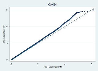

is generated in R using code like this, where the input file has no header, and 1 columns of p-values from a GWAS dataset:
load(sma)
load(plot)
wtccc <- read.delim("wtccc.frequentist.qq", header=FALSE)
wtccclogp <- -log10(wtccc$V1)
wtcccindex <- seq(1,nrow(wtccc))
wtcccuni <- wtcccindex/nrow(wtccc)
wtcccloguni <- -log10(wtcccuni)
qqplot(wtcccloguni,wtccclogp)
plot.qqline(wtcccloguni,wtccclogp)
see http://gettinggeneticsdone.blogspot.com/2009/07/advanced-qq-plots-in-r.html for more.
In STATA, I use code like this, where I generally run an association with the --adjust option in plink, and pull out the observed and expected p-values from the plink output, then where a is column 1 (observed) and b is column 2 (expected):
x = -log10(a)
y = -log10(b)
label if desired: e.g. label variable x "-log10P(obs)"
label if desired: e.g. label variable y "-log10P(exp)"
qqplot x y


No comments:
Post a Comment