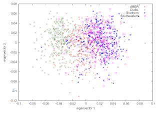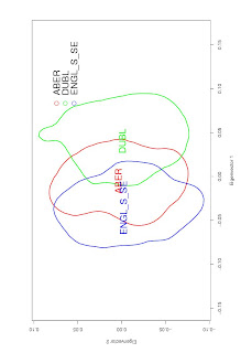
It can be useful to represent this as a Kernel Density plot, like this:

You can typically generate something like this using eigenvectors, e.g. .evec output from EIGENSOFT. The script looks something like this:
## Load library
library(adehabitat)
## Read the eigenvectors from the Eigensoft PCA analysis output file into a variable called, in this case, "ind_pca"
## You may have more columns than just X and Y if you chose to generate more eigenvectors. Adjust accordingly.
ind_pca<-read.table("XXXXX.evec", skip=1, col.names=c("Individual_id", "X", "Y", "A", "B", "C", "D", "E", "F", "G", "H", "Population" ) )
## Extract some useful variables from the table you just loaded
xy<-ind_pca[,c("X","Y")]
id<-ind_pca[,c("Population")]
colours<-c("blue", "green", "red", "orange", "pink", "darkgreen", "purple", "brown", "grey")
means = aggregate(xy, list(id), mean)
## Run the kernel density analysis, this uses the least-square cross-validation (LSCV) and 80% threshhold
hr<-kernelUD(xy, id, h="LSCV")
ver<- getverticeshr(hr, 80)
## Plot the result in a nice pdf
#pdf(file = "Kernel_density_plot.780.eig1_vs_eig2.pdf", width = 15, height = 15)
plot(ver, colborder=colours, colpol="NA", main="Population-wise PC kernel densities based on EIGENSOFT SMARTPCA computed eigenvalues", sub="", xlab="Eigenvector 1", ylab="Eigenvector 2" )
leg.txt<-c("ABER", "DUBL", "ENGL_S_SE")
legend(0.11, 0.08, "ABER", pch=1, col="red", title="", bty="n")
legend(0.11, 0.05, "DUBL", pch=1, col="green", title="", bty="n")
legend(0.11, 0.04, "ENGL_S_SE", pch=1, col="blue", title="", bty="n")
text(means$X, means$Y, names(ver), cex=0.5, col=colours)
#dev.off()


No comments:
Post a Comment